man with a beard and round glasses typing on apple computer wearing a dark-blue hoodie

Hello! I am Volodymyr

A Frontend Developer & WordPress Expert who
brings Figma designs to life with precision and performance in mind.
I specialize in building responsive, pixel-perfect, and high-converting websites using Elementor/Elementor Pro — ensuring fast load times, clean code, and flawless display on all devices.
Whether you need a new landing page, want to update content, or fix mobile bugs — I’ve got you covered.
Let’s make your website not just functional, but unforgettable.

What it takes to have a high-performance website?

Creating a website that works quickly, securely and stably is a complex process. Here are the key components that affect its effectiveness:

Choosing a hosting

Choosing the right hosting is critical for the speed and stability of your website.
It is recommended to choose a hosting service that uses SSDs instead of HDDs. SSDs have a much higher speed of reading and writing data, which significantly reduces the time it takes to load pages and respond to the server.
SSDs have a write speed of about 4-5 times faster than HDDs, and a read speed of 5-6 times faster.
Your sites will open 5 times faster than on HDD hosting. In addition, websites on SSD hosting work quickly even during peak load hours.
choose hosting

Choosing a WP Theme

Choosing the right WordPress theme is critical for the speed, security, and usability of your website.
It is recommended to choose lightweight, optimised themes that are not overloaded with unnecessary scripts and styles.
If you want to create a website with a custom design, I would recommend not buying a theme, but using a lightweight, free one and styling it to suit your needs – this way you will get a fast and productive website
On average, a website based on a lightweight theme can load 30-50% faster than a website based on a heavy multifunctional theme.
how to choose wp theme

Choosing WP Plugins

The choice of plugins should be as balanced as possible.
The fewer plugins you have installed on your website, the better for its performance, stability, and security.
Each plugin adds additional code that can increase page load times, create conflicts, or cause vulnerabilities.
Recommended use only necessary plugins, choose well-supported, optimised solutions from trusted developers. Each extra plugin means an additional load on the server, more HTTP requests, larger page sizes, and potential risks to website security.
how to choose wp plugins

Creating a Semantic Layout

The correct website structure starts with a semantic approach to layout.
Semantic structuring means the logical division of content into understandable blocks and sections that correspond to their content and function. This makes the site intuitive for both people and search engines.
When the content is properly organised: users find the information they need faster, The site is better indexed and ranked in search engines, increased accessibility for users with special needs
A well-designed structure provides not only visual aesthetics, but also increases the efficiency of user interaction with the site.
semantic layout

Creating a Responsive Layout

Responsive layout ensures that a website looks and works perfectly on any device – from a large monitor to a phone.
In today’s world, where most users access websites from mobile devices, responsiveness is a prerequisite for a successful website.
It is a critical factor for SEO – Google gives preference to mobile-optimised websites in search results
High-quality responsive design means not just “adjusting” the site to the screen size, but creating a convenient, fast and attractive interface for each type of device.
responsive layout

Powerful SEO Results

SEO optimisation is the basis of website visibility in search engines.
Without high-quality optimization, even the best website can remain invisible to potential customers.
SEO covers technical settings, page loading speed, mobile responsiveness, proper content structure, meta tags, internal linking, and media file optimisation.
Competent SEO optimisation is a long-term investment in the development of your online business.
SEO-up-kos
Hosting

Choosing a hosting

Choosing the right hosting is critical for the speed and stability of your website.
It is recommended to choose a hosting service that uses SSDs instead of HDDs. SSDs have a much higher speed of reading and writing data, which significantly reduces the time it takes to load pages and respond to the server.
SSDs have a write speed of about 4-5 times faster than HDDs, and a read speed of 5-6 times faster.
Your sites will open 5 times faster than on HDD hosting. In addition, websites on SSD hosting work quickly even during peak load hours.
choose hosting

Choosing a WP Theme

Choosing the right WordPress theme is critical for the speed, security, and usability of your website.
It is recommended to choose lightweight, optimised themes that are not overloaded with unnecessary scripts and styles.
If you want to create a website with a custom design, I would recommend not buying a theme, but using a lightweight, free one and styling it to suit your needs – this way you will get a fast and productive website
On average, a website based on a lightweight theme can load 30-50% faster than a website based on a heavy multifunctional theme.
how to choose wp theme

Choosing WP Plugins

The choice of plugins should be as balanced as possible.
The fewer plugins you have installed on your website, the better for its performance, stability, and security.
Each plugin adds additional code that can increase page load times, create conflicts, or cause vulnerabilities.
Recommended use only necessary plugins, choose well-supported, optimised solutions from trusted developers. Each extra plugin means an additional load on the server, more HTTP requests, larger page sizes, and potential risks to website security.
how to choose wp plugins

Creating a Semantic Layout

The correct website structure starts with a semantic approach to layout.
Semantic structuring means the logical division of content into understandable blocks and sections that correspond to their content and function. This makes the site intuitive for both people and search engines.
When the content is properly organised: users find the information they need faster, The site is better indexed and ranked in search engines, increased accessibility for users with special needs
A well-designed structure provides not only visual aesthetics, but also increases the efficiency of user interaction with the site.
semantic layout

Creating a Responsive Layout

Responsive layout ensures that a website looks and works perfectly on any device – from a large monitor to a phone.
In today’s world, where most users access websites from mobile devices, responsiveness is a prerequisite for a successful website.
It is a critical factor for SEO – Google gives preference to mobile-optimised websites in search results
High-quality responsive design means not just “adjusting” the site to the screen size, but creating a convenient, fast and attractive interface for each type of device.
responsive layout

Powerful SEO Results

SEO optimisation is the basis of website visibility in search engines.
Without high-quality optimization, even the best website can remain invisible to potential customers.
SEO covers technical settings, page loading speed, mobile responsiveness, proper content structure, meta tags, internal linking, and media file optimisation.
Competent SEO optimisation is a long-term investment in the development of your online business.
SEO-up-kos

The services I provide

I convert designs from Figma to HTML/CSS or Elementor with pixel-perfect accuracy. Adaptability, speed, SEO optimisation and WOW animations – I create websites that impress on any device.

my technologies
🎨💻 – Convert Figma design to: HTML/CSS, Elementor, Elementor Pro
🔍📐 – Pixel-perfect design implementation
📱👍 – Mobile-friendly design
📱🖥️ – Responsive layout for mobile, tablet, and desktop
⚡🚀 – Fast loading & optimization
🔍📈 – SEO-friendly structure
🪄🎉 – Smooth animations & interactivity for a WOW effect
🌐💠 – Elementor / Elementor Pro
📈👥 – High-conversion ready – get more subscribers and clients!
🌍🌏 – Multilingual websites with Polylang / Polylang Pro
🖼️🛠️ – Image optimization and lazy load
📬💬 – Configure and custom styles for contact forms from WPForms and Contact Form 7 plugins

Work steps

Each project goes through a clear and structured development process. From analyzing the design layout to testing and optimization — I handle every stage with attention to detail, performance, and best practices. This approach ensures a clean, responsive, and easily manageable website.

Design layout analysis and basic settings in wordpress admin

1.1. Design layout analysis

At the initial stage, I carefully analyze the design layout: its structure, grid, visual blocks, colors, typography, and interface behavior (how buttons, hovers, element states, etc. look like).
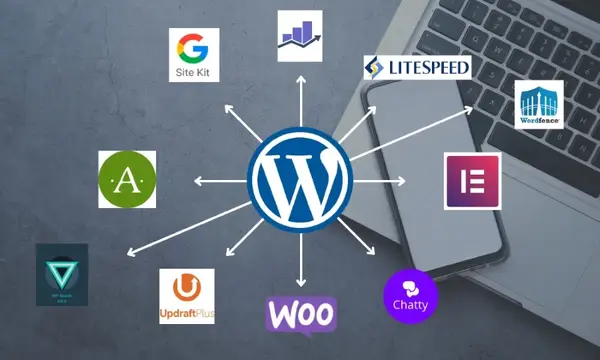
Сollect all the necessary graphic materials – icons, images
This analysis allows me to:
  • Build a clear architecture of styles and components
  • Prevent duplication of CSS classes and styles
  • Ensure the consistency of the site’s appearance on all devices

1.2. Image optimisation

After uploading the images, I optimize them by compressing them without losing quality and converting them to WebP format, which significantly improves the site’s performance.
This is an important stage because:
I don’t like to use plugins to automatically optimize images, as they create duplicate files, take up server memory, and can reduce overall performance. Instead, I optimize the graphics manually – with high quality and full control.
  • WebP has a much smaller size compared to JPEG/PNG
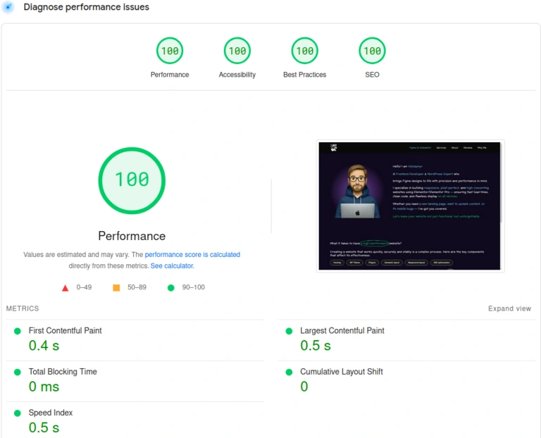
  • This has a positive effect on the score in PageSpeed Insights
  • Optimization improves mobile speed, which is critical because more than 80% of users access the site from their phones

1.3. Setting global styles

After analyzing the layout and preparing the graphics, I move on to setting up the basic styles in the WordPress admin panel. This includes:
  • Setting the main font according to the layout
  • Setting the color palette that will be used throughout the site
  • Setting line heights, line spacing, and font boldness
  • Create styles for buttons, links, forms, and other common elements
  • Adding a favicon (an image that is displayed in a browser tab), taking into account the light and dark theme of the browser for correct display
These settings create a single stylistic framework that is reused across all pages. This approach allows you to quickly scale your site, avoid duplicate CSS, and makes it easy to make changes in the future.

1.4. Optimization font loading

Fonts are not only a part of style, but also an important performance element. I analyse how it is loaded and take steps to avoid CLS (Cumulative Layout Shift) – when elements shift during page load.
Depending on the situation:
  • Choose the most efficient way to connect the font
  • Provide text pre-rendering
  • Minimise delays so that the UI/UX does not deteriorate
This improves the overall score of the site in Core Web Vitals and provides a stable interface from the first second.

Building Base Components with Responsive Design

2.1. Setup Responsive Layout

To ensure correct website adaptability, I customize media queries. I usually use four main breakpoints: 576px, 767px, 1024px, 1200px – these values cover most types of devices: smartphones, tablets, laptops, and desktops.
As a result, the site structure scales to fit any screen width, and the user experience remains convenient and stable regardless of the device.

2.2. Base components

At this stage, I create key components that are repeated on all pages:
  • Header – with a logo, navigation, and other elements
  • Navigation Menu – with adaptive behavior (hamburger menu, hiding, drop-down lists, etc.)
  • Footer – with contact information, links, and additional blocks
After the layout of each component, I immediately implement their adaptive logic – I ensure correct display, change the structure, font size, and indents depending on the screen width.

Semantic and accessible layout based on Figma design

3.1. Creating a page/pages from the layout

At this stage, I start the main layout of the website pages according to the layout in Figma. In addition to accurately recreating the look and feel, I pay special attention to the semantic structure of the HTML and the accessibility of the content.
What I do:
  • I use semantic HTML tags (<header>, <main>, <section>, <article>, <nav>, <footer>) to structure the content correctly
  • I follow the logical order of the headings – from <h1> to <h6>, without gaps, to ensure correct indexing and convenience for users with special needs
  • I add aria-label for buttons, icons, and links where there is no visible text – this helps screen readers understand the purpose of the elements
  • All images receive alt-texts that describe the content of the image or its function – again, with accessibility and SEO in mind
  • Ensure the correct order of elements in the DOM structure so that the site is easy to navigate via the keyboard
  • I check that the interface is screen reader friendly and meets the basic requirements of WCAG (Web Content Accessibility Guidelines)
  • Add meta titles and meta descriptions for all pages
This approach makes it possible to make the website not only beautiful, but also technically competent, convenient for all categories of users and prepared for high-quality SEO optimization.

3.2. Contact form

If the layout includes a contact form (for example, on the Home page or on the Contact Us page or in the footer), then at this stage I also implement its layout and integration.
For the form to work properly, you need to configure sending emails via SMTP (so that messages do not end up in spam). I use the WP Mail SMTP plugin, which allows you to correctly configure email integration. To do this, the customer is required to provide:
  • Client ID
  • Client Secret
This data is generated in Google Cloud Console for Gmail SMTP integration, or the corresponding email platform
Also, if you plan to use spam protection with Google reCAPTCHA, you must provide:
  • Site Key
  • Secret Key
This data obtained in the Google reCAPTCHA admin panel.
This data can be transferred to me in a convenient way – it is required only once for setup, after which everything works automatically.

Final testing, optimization, and support

At the final stage, I conduct full testing of the site on all major devices and screen resolutions – from mobile to large desktops. I make sure that all elements are displayed correctly, do not move, and are fully responsive.
I also analyze website performance using services like PageSpeed Insights. In case of low performance, I take measures to improve it: optimize images, scripts, check fonts and caching.
After that:
  • Collect feedback from the customer
  • Fix minor bugs or comments on my work, if any
  • If necessary, provide instructions on how to edit the content yourself (via Elementor or WordPress admin. I can create a separate Google document with instructions and screenshots if you want to have a handy guide at hand.
After the project is completed, I provide free technical support for another 14 days: If there are any visual corrections or questions about my part of the work, I will make them or explain how to resolve the situation.

Contacts

This contact form is built using WPForms — one of the most powerful form plugins for WordPress. The Pro version allows you to collect even more data, including how long a user spent on your site and which pages they visited before submitting the form.
Custom styles and field validation with custom error messages have been added to this form to improve usability.
I intentionally left the reCAPTCHA visible here to demonstrate how spam protection appears in the form. However, it’s important to know that the default reCAPTCHA setup can reduce your site’s speed by up to 30% on mobile devices.
I always analyze every element in terms of performance. In this project, the reCAPTCHA script has been optimized — and that’s exactly how I work with every client: functionality + maximum speed.

0/3600